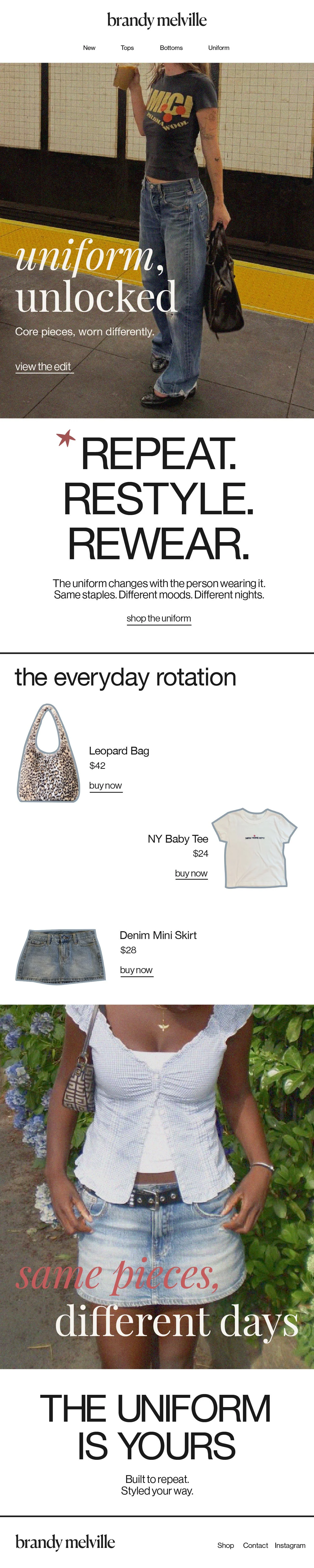
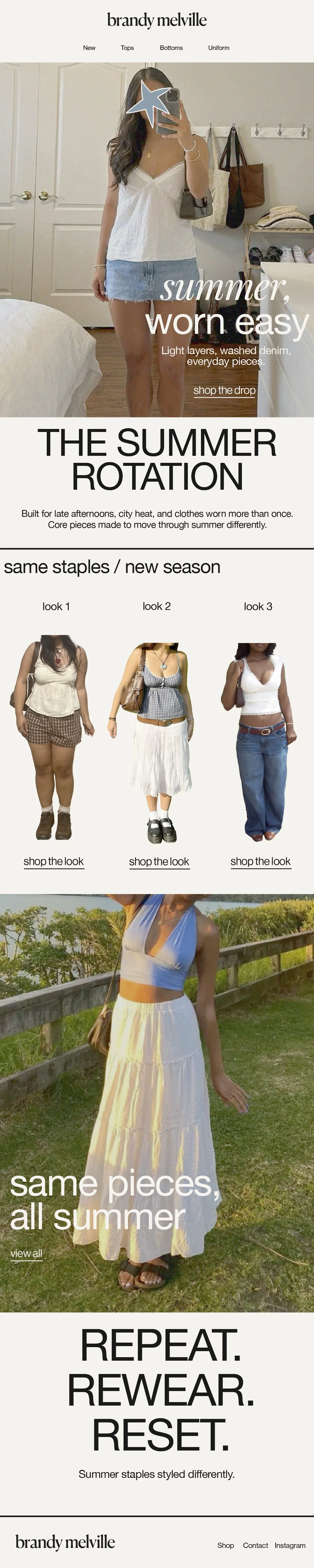
Brandy Melville Rebrand
This project re-imagines Brandy Melville through the concept of “Cool Girl Uniform 2.0.”
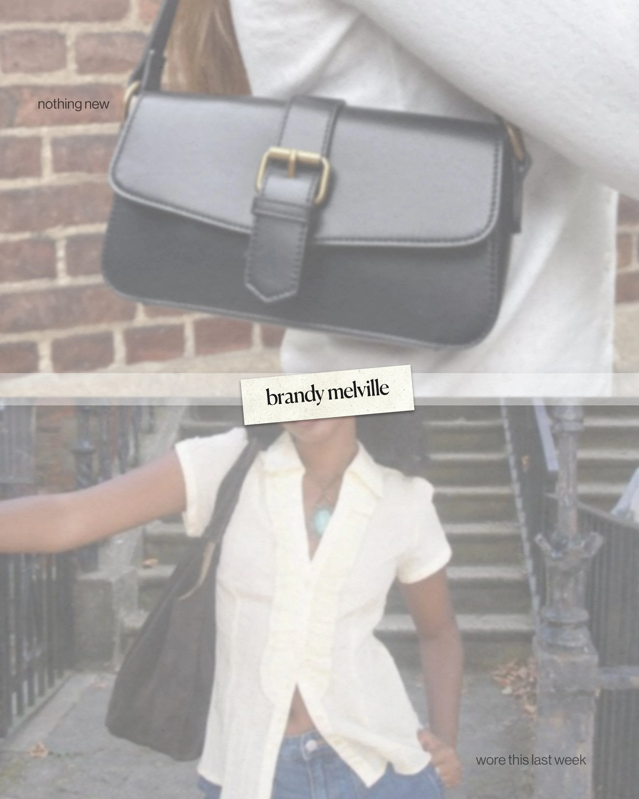
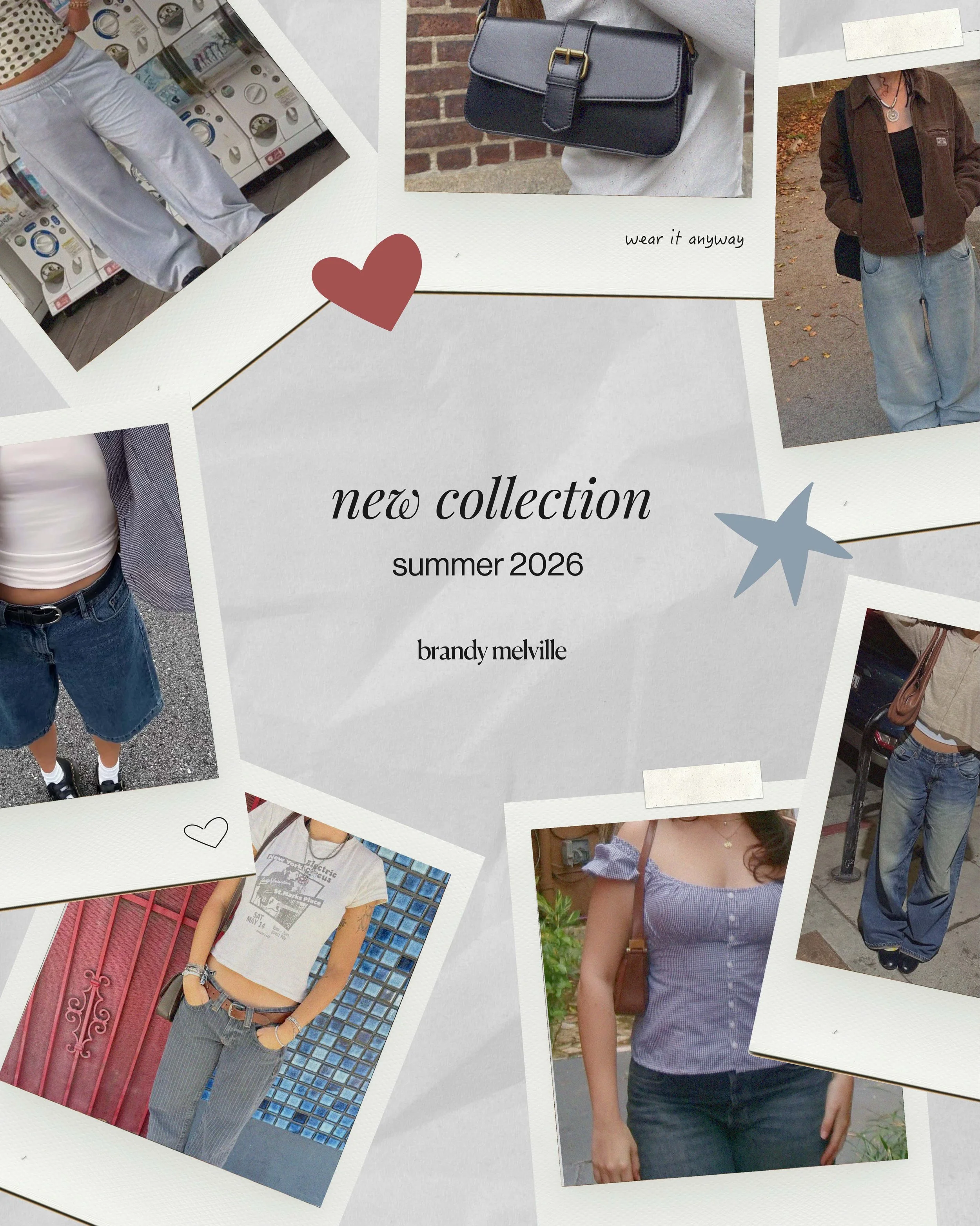
The redesign shifts the brand away from an exclusive identity toward a more inclusive and expressive system, and shows pieces across different individuals, aesthetics, and lifestyles.
Instead of defining one “Brandy girl,” the project positions the brand as a flexible framework for personal style. Through art direction, typography, and digital campaign design, the work explores how repetition, variation, and subtle storytelling can create a cohesive and diverse visual identity.
The outcome focuses on building a modern, editorial-driven presence that reflects contemporary youth culture, individuality, and everyday wearability.
2026
Brand Identity
Creative Direction
Campaign Design
Logotype
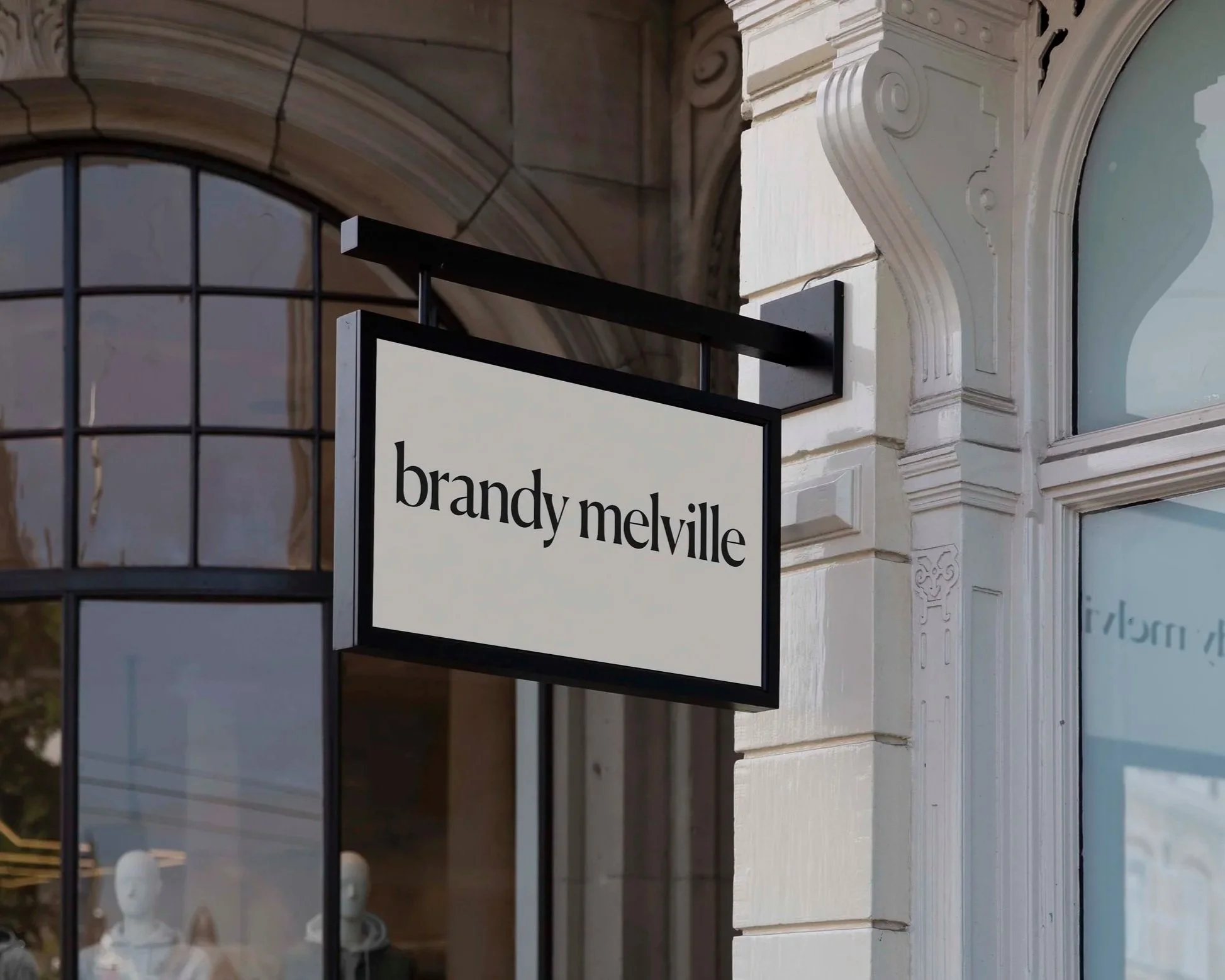
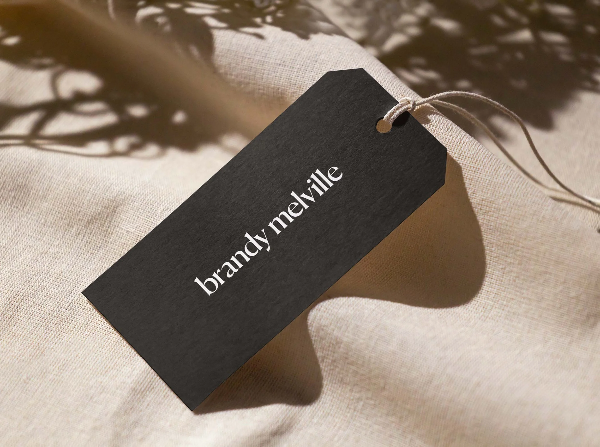
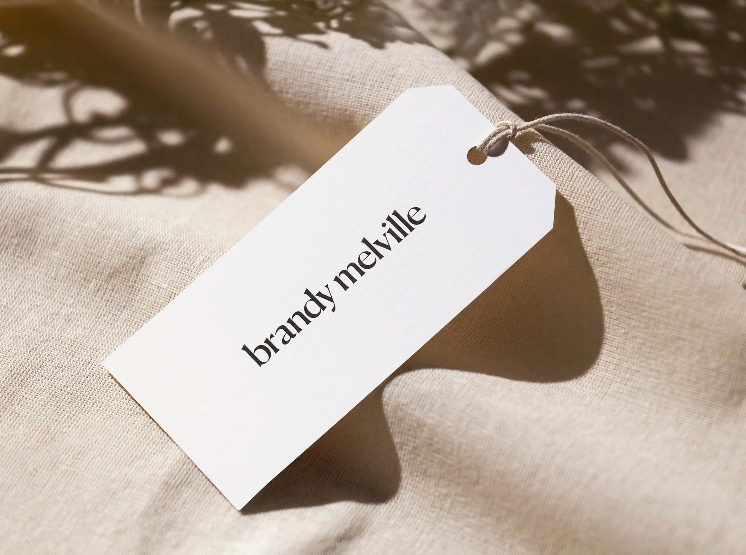
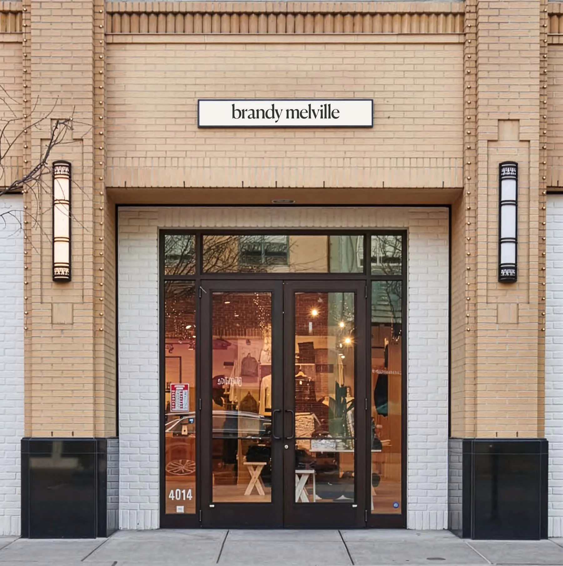
For the logo redesign, I took a subtle approach, refining Brandy Melville’s existing serif mark to feel more modern and editorial while keeping it recognizable. I focused on small adjustments to typography, spacing, and proportions to make it more balanced and flexible, so it can adapt naturally across different styles and identities.
Colors & Type
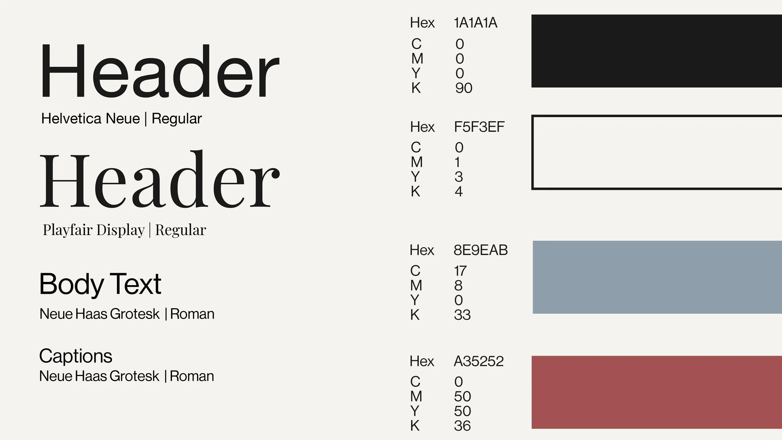
For the color palette, I wanted something that felt natural and lived-in rather than overly polished. I built a muted, neutral base with soft creams, washed blacks, and subtle tones of blue and red to reflect the everyday, wearable nature of Brandy Melville. The goal was to create a palette that feels versatile, while still allowing small moments of color to add personality without overpowering the overall look.

Instagram Campaign

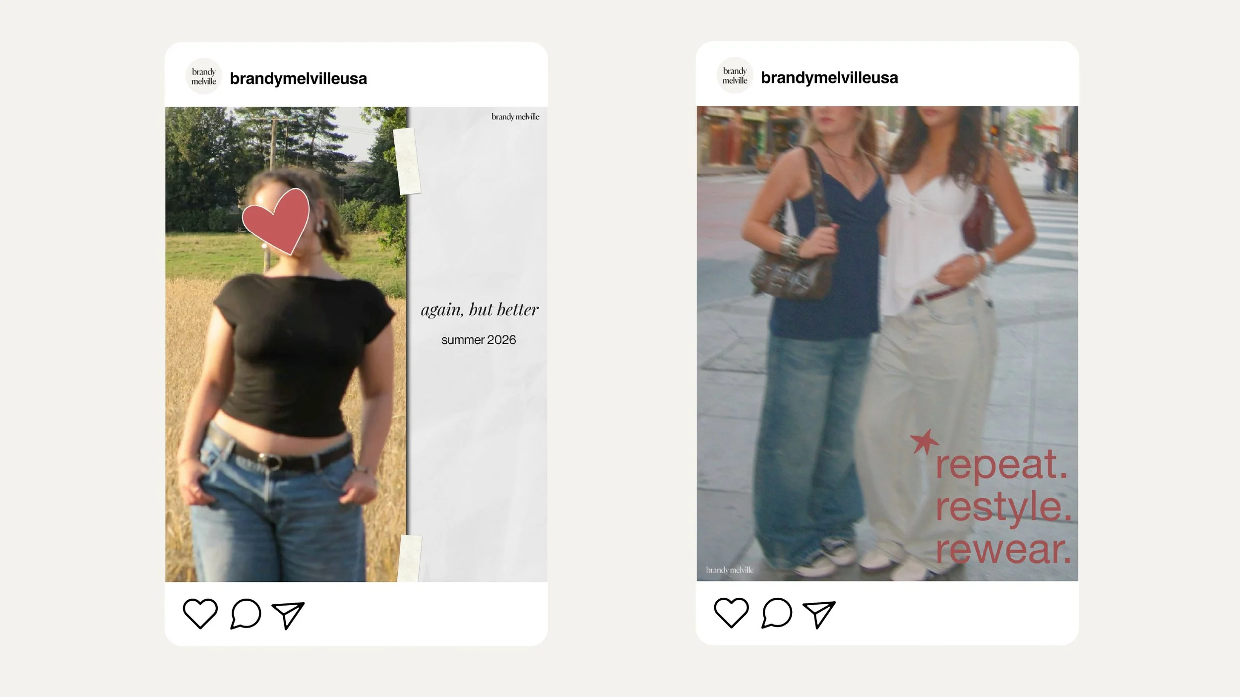
Digital
Application